Spotly App Design
A visual way to organize the restaurants and cafés you save from TikTok.
2026
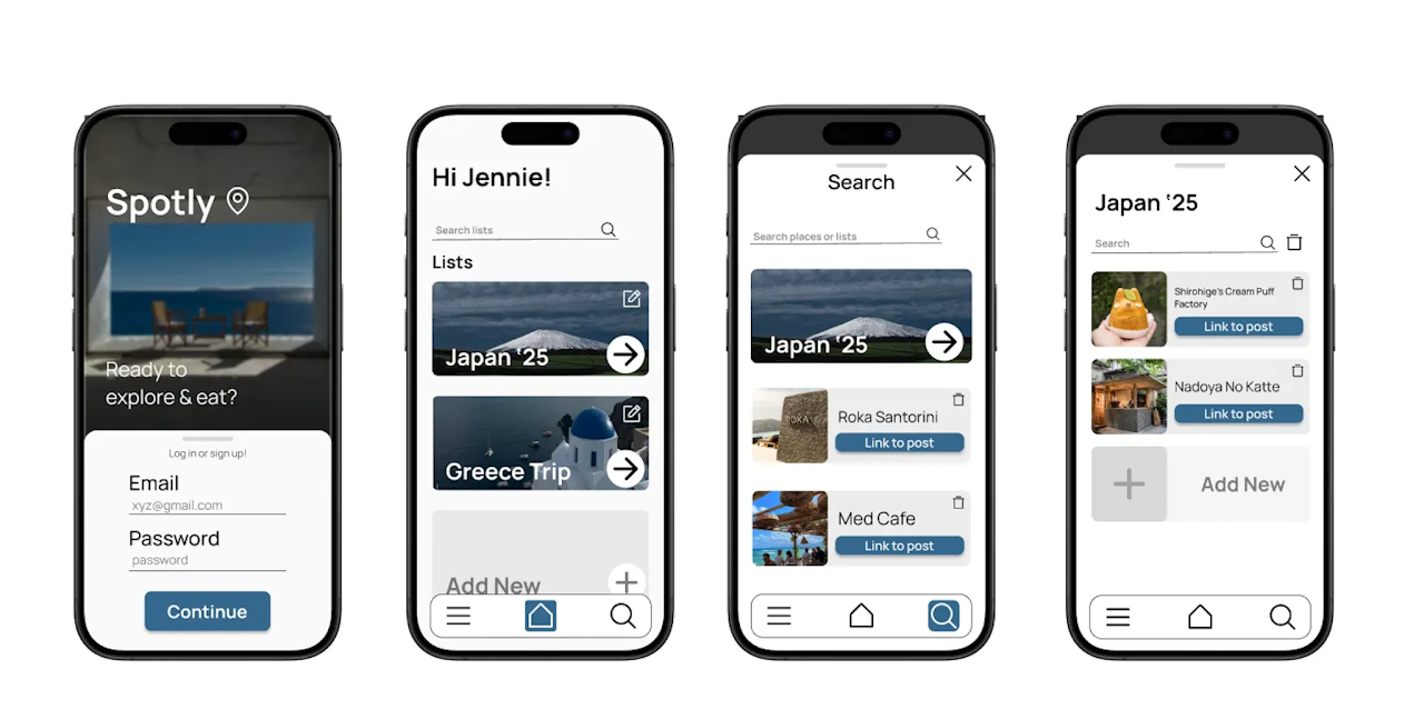
High-fidelity MVP
Overview
Spotly
Mobile app · MVP design exploration
A visual way to organize the restaurants and cafés you save from TikTok.
- Role
- Product Designer
- Goal
- Organize saved eateries for Millennials and Gen-Z
- Result
- Create and delete lists and places, with notes
- Tools
- Figma
The problem
Saved, then lost.
“I can’t find that one cute restaurant/cafe TikTok I saved!”
People discover restaurants and cafés through TikTok, then lose them inside a growing saved collection. Note apps and TikTok bookmarks do not offer an organized, visual way to browse those places later. In addition, having a central place to directly import tiktoks is much easier than hopping between platforms.
Reddit research
“I usually just dump them in google maps with a little note on what i saved them for. way easier than trying to dig through instagram saves when the trip actually comes around”— reddit user 1
“My google maps is full of flagged locations that I might want to try. When I'm planning a trip I'm usually hopping between my browser, the maps, my notes app, and my booking apps to keep things straight.”— reddit user 2
Design strategy
Recognition over recall.
Spotly turns saved restaurants and cafés into visual lists, making places easier to recognize and scan. Its identity draws from the exploratory, image-led qualities of Airbnb, Uber Eats, and Pinterest.
01
Photo first
Prioritize imagery over names to make places recognizable at a glance.
02
Easy to scan
Use large images so saved lists can be browsed quickly.
03
Keep it quiet
Minimal typography and layouts keep the focus on the places.
04
Built for reading
Use Manrope throughout the product interface for clarity.
Process
From early structure to high-fidelity MVP
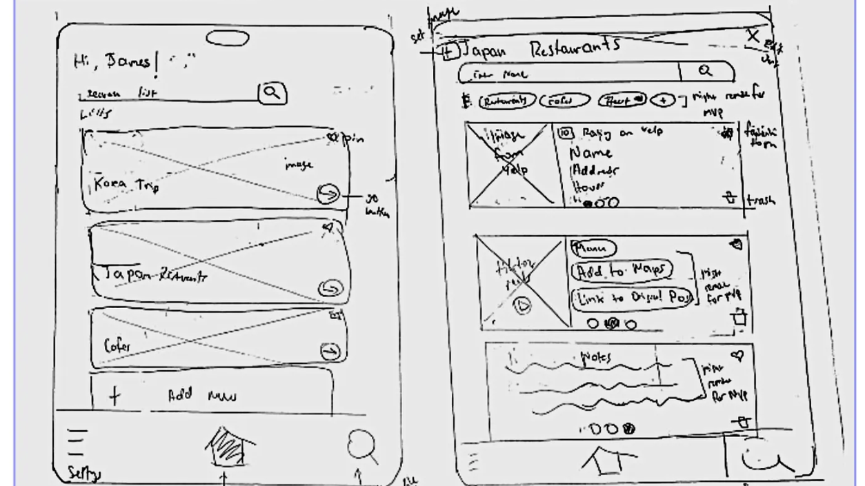
01 · Sketches · Pen & paper
Finding the essential shape
I sketched the list and place views to establish the basic layout and information hierarchy. Working quickly on paper made it easier to balance useful features without overwhelming the interface.
Learning
Early sketching clarified the essential functions before moving into Figma.
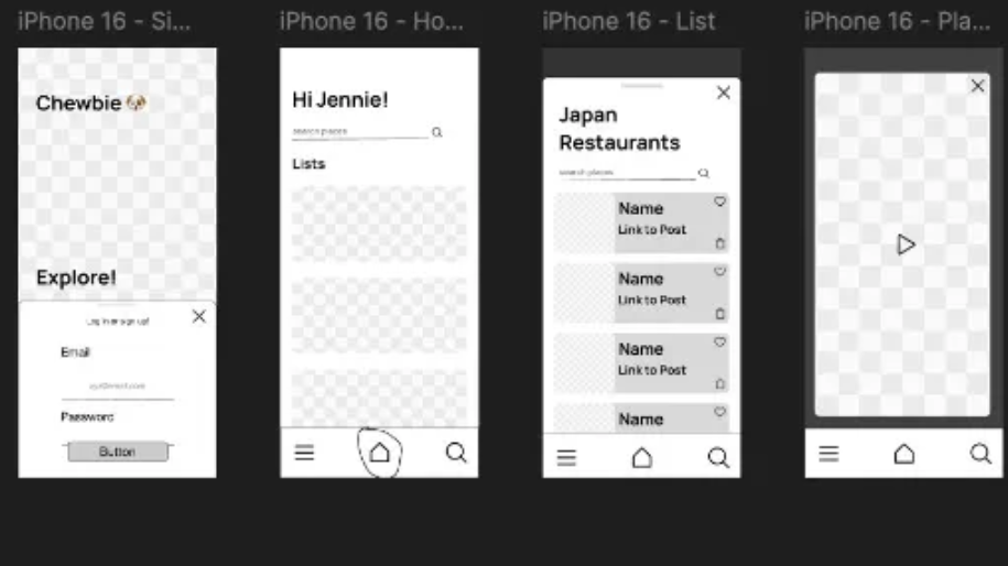
02 · Low-Fi · Figma
From sketches to a working system
The paper concepts became digital wireframes, where interactions, navigation, and hierarchy could be refined across the key screens.
Iteration
Filters and list settings initially created visual clutter. I removed less critical features and simplified the interface, creating a clearer hierarchy and a more focused experience. Learning · Iterating in Figma helped establish a clearer, more focused interface.
03 · High-Fi MVP · Figma
A consistent visual system, applied end to end.
The final interface brings together list navigation, add and remove actions, and a photo-forward hierarchy. Building with components and Auto Layout kept patterns consistent across screens.
Learning
Creating a consistent visual system, developing branding and UI, and using Figma components and Auto Layout strengthened the final MVP.
Final design · High-Fi MVP · Figma
A consistent visual system, applied end to end.
The final interface brings together list navigation, add and remove actions, and a photo-forward hierarchy. Building with components and Auto Layout kept patterns consistent across screens.
Reflection
What I gained
- Creating a consistent visual system
- Developing branding and UI
- Using Figma components and Auto Layout
- Iterating from sketches to a high-fidelity MVP
Where Spotly could go
- Sharing lists
- Integrated TikTok video player
- Support for Instagram Reels
- Support for YouTube Shorts