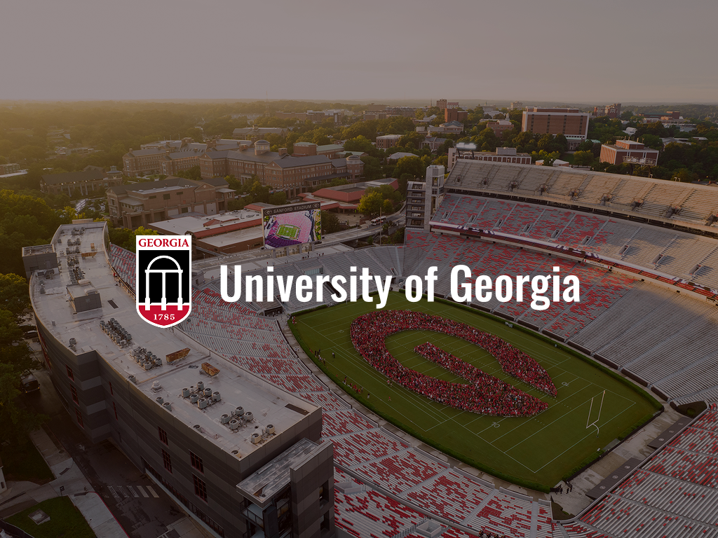
UGA Mobile App Redesign
Redesigning the University of Georgia mobile app for current students, using imagery to improve recognition and diversify the text hierarchy.
2026
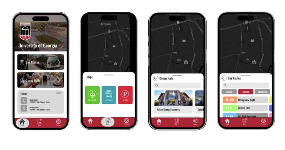
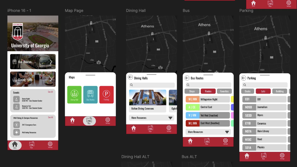
High-fidelity MVP
Overview
UGA Mobile App Redesign
Mobile app · MVP design exploration
Redesigning the University of Georgia mobile app for current students, using imagery to improve recognition and diversify the text hierarchy.
- Role
- Product Designer
- Goal
- Redesign the app for current students using imagery
- Result
- MVP visually organizing home, bus, dining, and parking
- Tools
- FigJam, Figma
The problem
Informational, not experiential.
The existing app leans on pictograms without photos, which reduces visual clarity. Information overload hurts navigability, and the app lacks modern design appeal or a clear prioritization of the goals students actually have — bus, dining, and parking. It is usable but cluttered, and disconnected from the events, dining halls, bus stops, and parking it should surface.
Design strategy
Recognition over pictograms.
UGA turns the app's main functions into recognizable, image-forward entry points. The design emphasizes photo recognition over names, uses large images for main functions and locations, and follows UGA's official style guide. Its visual identity was inspired by the exploratory, image-led qualities of the Michigan State app, Airbnb, and Uber Eats.
01
Photo first
Emphasized photo recognition over names to reduce cognitive load.
02
Large images
Used large images for main functions and locations.
03
Brand-aligned
Followed UGA's official style guide for colors, typography, and imagery.
04
Built for exploration
Visual identity inspired by the Michigan State app, Airbnb, and Uber Eats.
Process
From early structure to high-fidelity MVP
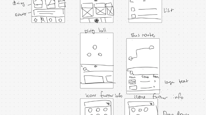
01 · Low-Fi · FigJam
Finding the frequent functions
I used FigJam to brainstorm and capture the app's frequent main functions and to organize the information hierarchy before moving into higher fidelity.
Learning
Early ideation clarified the essential functions and the hierarchy before moving into Figma.
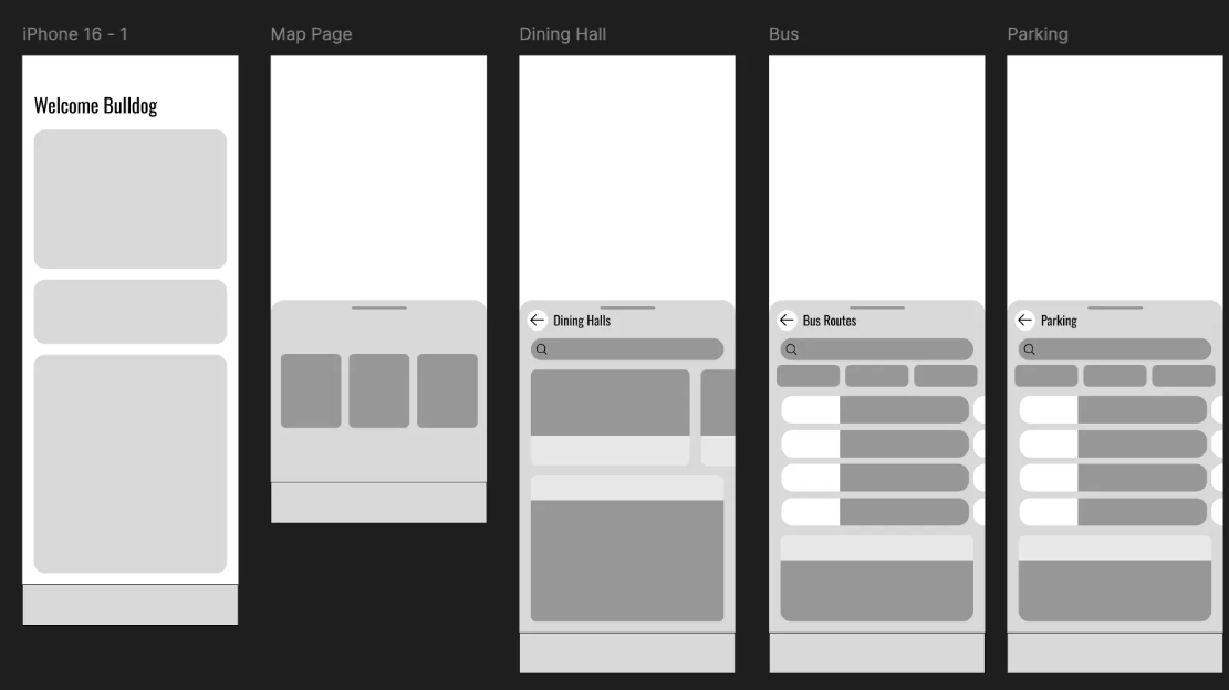
02 · Med-Fi · Figma
From layout to a working hierarchy
The FigJam concepts became digital wireframes in Figma, where I introduced visual hierarchy and photo placeholders across the home, maps, dining, bus, and parking screens.
Iteration
Introducing visual hierarchy and photo placeholders risked clutter. I iterated the layout and hierarchy multiple times and reduced visual noise so the interface stayed clean without overwhelming users. Learning · Iteration helped establish a clearer hierarchy and a more focused interface.
03 · High-Fi MVP · Figma
Brand guidelines, meet a modern layout.
The final interface aligns UGA's official style guide with a modern, user-friendly design — finalized visuals, interactive elements, and an improved home screen layout across home, maps, dining, bus, and parking.
Learning
Aligning brand guidelines with UX best practices while using Figma components and Auto Layout created a consistent visual system.
Final design · High-Fi MVP · Figma
Brand guidelines, meet a modern layout.
The final interface aligns UGA's official style guide with a modern, user-friendly design — finalized visuals, interactive elements, and an improved home screen layout across home, maps, dining, bus, and parking.
Reflection
What I gained
- Creating a consistent visual system
- Aligning brand guidelines with UX best practices
- Using Figma components and Auto Layout
- Iterating from FigJam sketches to a high-fidelity MVP
Where UGA could go
- Initiate UX research to gather user insights
- Refine the design and map/bus functions
- Add a MyUGA section
- Add Well-being and Academics sections