eatAround

Designing a global food discovery app
2026
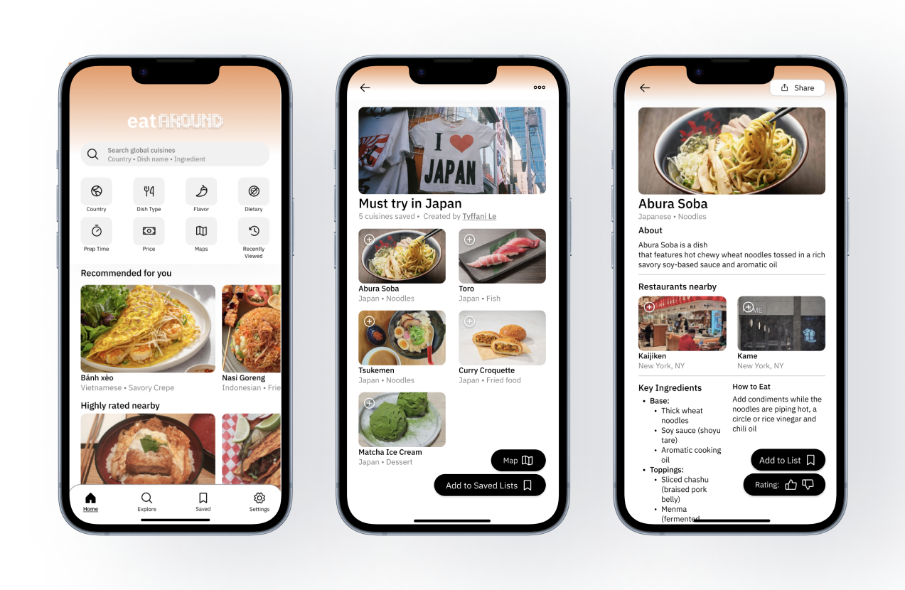
High-fidelity prototype
Overview
How can people find new global cuisines to try in a personalized central place?
There is no efficient solution to discovering and saving a list of cuisines to try. It’s inconvenient to search for something new to try when you’re abroad, hungry after a long day, or in a time crunch with friends. This was the starting point for EatAround to bridge the gap between finding something to eat and actually trying the new cuisine.
- Product Designer
- August 2026 – September 2026
- Figma
- UI/UX Design, User Research, Personal Project
Solution
A global food discovery app that gives you personalized cuisine recommendations.
The ultimate goal is to encourage people to try new foods — through personalized recommendations, shareable friend lists, and discovery.
THE PIVOT
So I dug deeper until my stomach rumbled.
- Initial concept
- Map-based travel photo gallery.
- Interview signal
- Users already use Apple Photos / Instagram; the real unmet friction was choosing what to eat.
- The shift
- From passive photo archiving to active global food discovery.
The first idea for this project was an app visualizing photos taken around the world, inspired by my time abroad in Korea and all the photos I captured.
Early interviews showed people would not use it often and preferred timelines over geographic photo arrangements. Apple Photos, Google Images, and Instagram already offered similar features.
- 01
The idea was interesting but didn't solve a clear pain point.
- 02
People prefer new experiences than looking back on old ones.
Research
Listening before designing
Initial observations
People outsource their taste from social media, maps, blogs, forums, friends & family.
- Difficulties saving
- Recommendations are scattered across many sources and hard to keep in one place.
- Personalized recommendations
- People want suggestions that reflect their own taste.
- A concise way
- Information needs to be quick to scan when deciding what to eat.
Approach
I used the Double Diamond framework to understand the problem from open discovery to an MVP prototype.
- 01Diverge
Discover
User interviews, competitive research, personas, first principles thinking
- 02Converge
Define
Key insights, job to be done, opportunities and constraints
- 03Diverge
Develop
User journey, paper wireframe, low-fi prototype
- 04Converge
Deliver
Usability testing, iteration, hi-fi prototype
User Interview
I conducted semi-structured interviews with 5 participants. The participants were selected based on age. The targeted demographics were Gen Z and Millennials as they are more likely to try global cuisines than any other demographic (IFT.org). Each interview lasted approximately 30 minutes. These are some of the common responses:
Travel coordination
“When I travel with my family, I want to try local food, but it takes a lot of time researching what to eat and coordinating with my family”
Scattered sources
“On the weekends I try new restaurants / new foods with my roommates. We usually pick from a list of saved tiktoks that are unorganized”
Focused feed
“It would be cool to have like a focus feed of foods to scroll and look at”
Reddit Research
Ingredient familiarity
“This is why I like cooking food. It makes me understand the food itself and made the ingredients less scary.”— reddit user 1
Psychological safety
“I like trying things on my own or in a very supportive environment. Having mean people watch you taste things is awful.”— reddit user 2
// Comparative analysis takeaways
- 1
Personalized feeds — Builds familiarity through repeated exposure and preference-based suggestions.
- 2
Ingredient transparency — Shows background and ingredients upfront to ease food aversions.
- 3
Low-friction flows — Quick save-and-organize loops that replace messy TikTok/notes app hopping.
The opportunity
How might we design an app that eases the learning curve of trying new cuisines in a curated and approachable way?
People want to try new food, but their willingness depends on familiarity, accessibility, past experiences, and perceived risk. So, the main focus is reducing the learning curve, making it more approachable, and personalized.
Job to be done
“When I want to discover food from different cultures, I want an efficient and easy way to find, understand, and save foods, so I can confidently try new foods without feeling overwhelmed.”
DESIGN STRATEGY
Reducing the learning curve
[Reduce cognitive strain]
- Concise list
- Visual recognition
[Increase approachability and trust]
- Trending foods for a sense of community
- Lists from friends and family
- Personal filters and search
[Make it personalized]
- Recommended lists
- Likes and dislikes
- Feedback loop
[Considerations / Constraint]
- Huge number of countries & cuisines
- Location/accessibility (especially rural areas)
- Dietary restrictions, aversions & disorders
- Avoid American-centered taste framing yet remain accessible at any level of experience
PROCESS
From flow to prototype
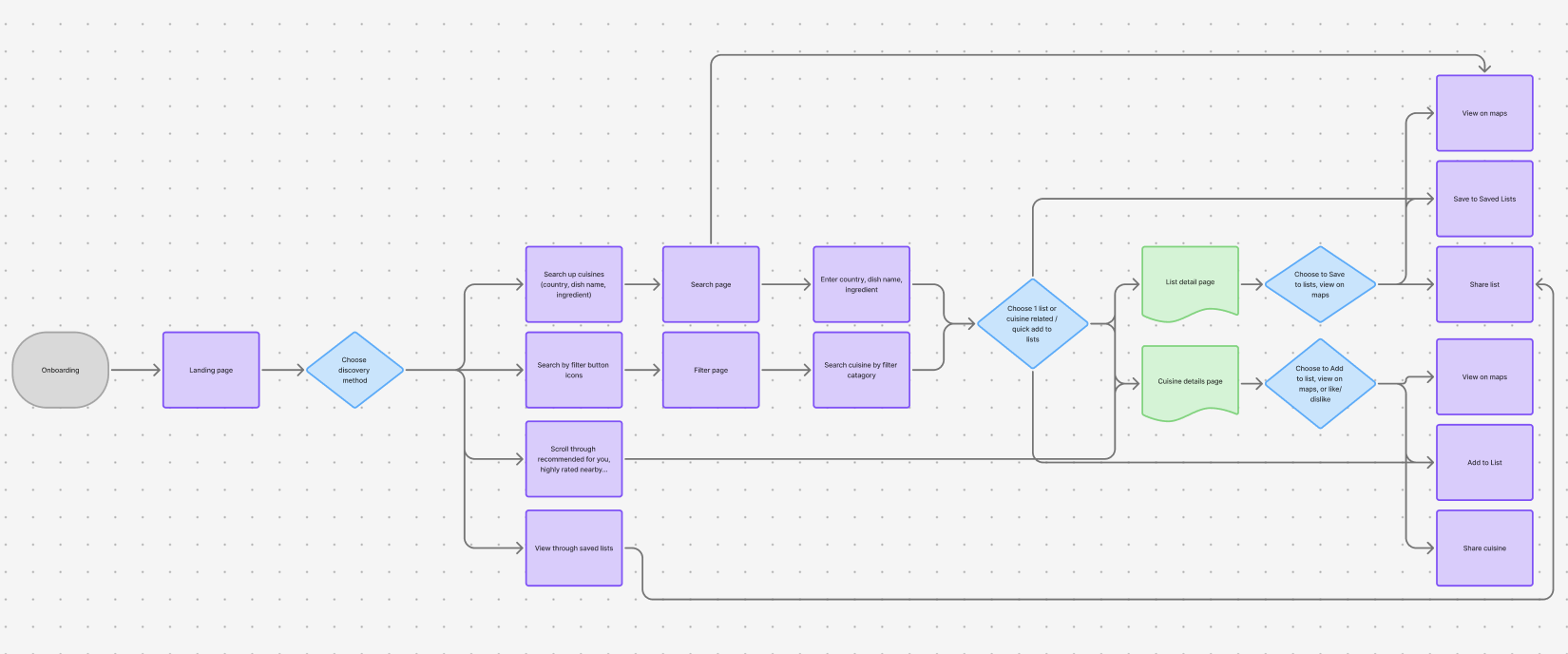
User flow
Visualize the main basic flow of finding a cuisine and saving it to a list.
Paper wireframe
Transfer thoughts onto paper and initial thoughts. Using the user research, I focused on:
[Familiarity]
Familiarity of components (i.e. consistent icons, scrolling layouts) for easier visual recognition and access.
[Approachability]
Rounded corners & buttons, large images for lists, simple text & typography, gradient orange to bring warmth.
[Personalization]
Filters, recommendation, like/dislike button, editor’s pick & shared lists for community.
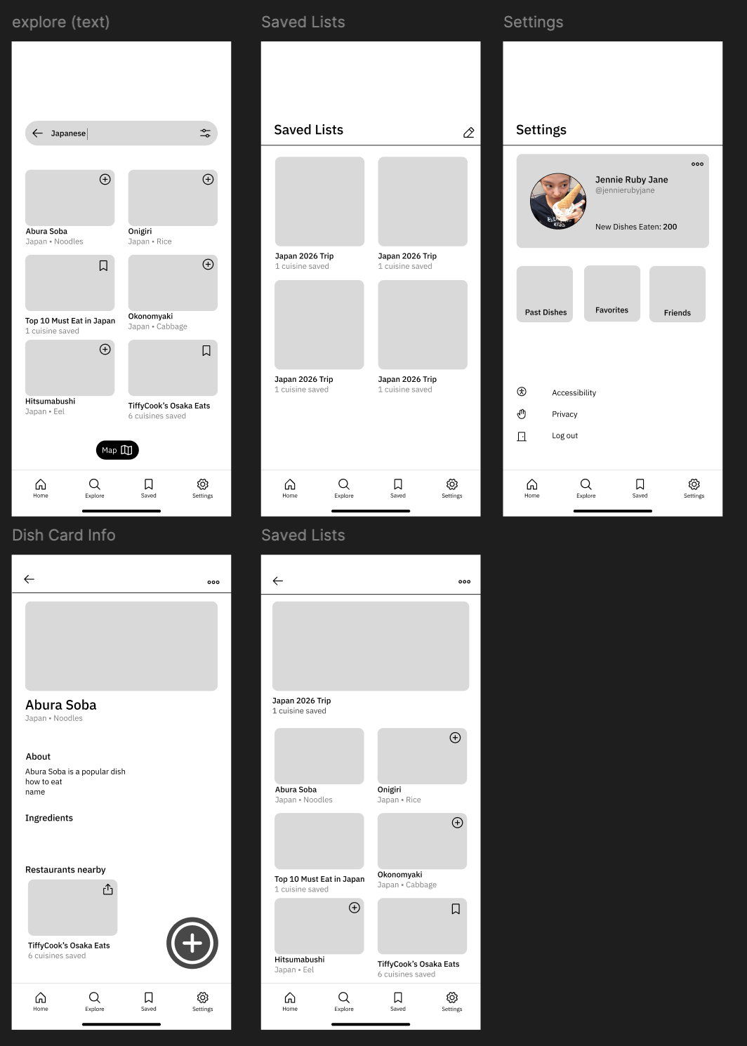
Lo-fi designs
- Sketch to Figma
- Refine layout & sizing
- Get an idea of information structure and call to action buttons
- Content is king, anything else is extra
Final design
Hi-fi designs
Transitioned from exploratory wireframes to polished screens with real photos and dish names.
- 1Visual-first dish cards prioritize photo recognition over names.
- 2Friend and curated lists build trust and familiarity.
- 3Dish details show ingredients and how to eat, lowering the barrier to trying.
What changed from lo-fi to hi-fi
- Visual recognition
- Lo-fiPlaceholder blocks
- Hi-fiReal photos and dish names for visual recognition.
- Lowering the barrier
- Lo-fiDish names only
- Hi-fiDish details show ingredients and how to eat, addressing food aversions from research.
- Warmth & approachability
- Lo-fiNeutral wireframe shapes
- Hi-fiRounded components and warm color carry the approachability principle.
- Clearer hierarchy
- Lo-fiRough layout & sizing
- Hi-fiRefined layout so lists and calls to action scan quickly.
Next: components — Building a reusable component system is the next refinement.
Next course
What comes next
Track 01
Design & accessibility
- Perform usability testing (script)
- A/B testing for increasing CTA engagement
- Further polish components and visual layout
- Include recommended recipes
- Optimize filter options for dietary restrictions, aversions & disorders
- Iterate following WCAG 2.2 Standard
Track 02
Product & engineering
- Pull info from an unbiased API
- Implement solutions for edge cases: image size & nested loop of saved lists
- Line up search bar text with maps function
- Iterate using usability findings
- Establish project timeline
- Track retention / success data
Reflections
Looking back, moving forward
Make it exist, then refine it
To be honest I had difficulty with executing this project until I realized that it’s to be expected for ideas to be messy.
Action Creates Clarity
By taking a step forward, it reduces the cognitive load needed to figure out the next step.
Design isn’t dining solo
Design is an intimate thing, but the best designers are vulnerable to showing the messy.